I’ve tackled blank walls by starting with a gallery wall of mixed-sized frames—I lay everything on the floor first to avoid mistakes. Then I add textiles like tapestries for warmth, layer in mirrors opposite windows to brighten the space, and include trailing plants at staggered heights. I vary heights and maintain 2–4 inches between pieces. Proper lighting highlights everything beautifully. The key? Don’t overthink it—let your story unfold naturally through layers. There’s plenty more to explore about each technique.
Start With a Gallery Wall of Photos and Prints

One of my favorite ways to work with a blank wall is creating a gallery wall—and honestly, it’s easier than you might think. I’ve learned that mixing different frame sizes and styles actually makes the display more interesting. Before I hammer anything, I lay out paper cutouts on the floor to plan the spacing and balance. This prevents those frustrating mistakes.
I combine various materials like canvas, wood, and metal frames to add texture and depth. What really brings my gallery wall to life is choosing a theme—family photos, travel memories, or inspiring quotes. When I curate images around something meaningful, the wall tells my story. It’s not just decoration; it’s a reflection of who I am and what matters most to me.
Choose Your Style: Canvas, Frames, or Mixed Media

When I decorated my living room last year, I found that canvas prints gave my favorite family photos a polished, gallery-worthy look at a reasonable cost. I mixed in some simple black frames and a few metal prints to add texture and visual interest, which helped create a more deliberate aesthetic on the wall. You can start with one or two canvas pieces in 16×20 or 20×24 sizes, then build around them with other materials until your wall displays your story the way you want it to.
Canvas Prints For Memories
How’d you like to turn your favorite photos into professional-quality wall art? Canvas art displays your memories as gallery-quality pieces using UV-protected inks that keep colors vibrant for years. Canvas prints offer a polished look that standard frames can’t match.
You’ve got real flexibility here. Choose from various sizes—maybe a 16×20 for your living room or smaller 8×10 pieces for a hallway. Want something unique? Try circles or hearts instead of rectangles. The wrap styles give it a finished, frameless appearance that feels modern.
What stands out is the customization. You upload your photo, preview it online, and CanvasChamp handles fast production at reasonable prices. It’s straightforward. Your blank wall becomes a personal gallery that expresses who you are.
Mixed Media Gallery Walls
Canvas prints work beautifully on their own, but mixing them with frames and other materials creates something more interesting. When I combined textile wall hangings with metal frames and canvas prints, my blank wall became a reflection of my tastes.
Start by laying everything on the floor first. I arrange my pieces—different frame sizes, textures, and materials—until the spacing feels balanced. A cohesive color palette ties everything together, even when styles vary dramatically.
Consider a central focal piece surrounded by smaller elements. I use this approach with a large canvas print anchored by smaller framed photographs and a woven textile hanging. This mixed media gallery wall strategy lets you showcase what matters most while maintaining visual depth and personality throughout your space.
Add Softness With Tapestries and Textile Hangings

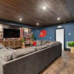
If you’ve ever walked into a room that felt cold or empty despite having furniture, you know that hard surfaces like bare walls don’t help—they actually make spaces feel more sterile. That’s where textiles come in. I’ve found that hanging a tapestry or fabric panel works well in a room. Macramé, woven tapestries, and fabric panels each bring their own texture and warmth. When I hung a 60-by-80-inch woven tapestry above my sofa, the space suddenly felt inviting. Beyond aesthetics, textiles soften acoustics—sound doesn’t bounce around as harshly. They’re also flexible; you can swap them seasonally without permanent commitment. Layer textiles with photos or small art pieces to create depth. This approach makes any blank wall more livable.
Style Floating Shelves to Showcase Your Personality

Floating shelves are one of my favorite ways to display what matters to you without eating up floor space. I’ve used them to create gallery-like displays that are distinctly personal.
Here’s what works best:
- Vary your shelf heights to create visual interest and accommodate different items
- Mix textures like ceramic, wood, and metal for depth and contrast
- Combine photos, small sculptures, and keepsakes with greenery for personality
- Mount securely into studs or use wall anchors to prevent sagging
When I styled my shelves, I arranged meaningful keepsakes alongside potted plants and framed photos. The varied heights made everything feel purposeful. That textural mix—smooth ceramic next to rough wood—drew the eye naturally. Your floating shelves become a personal story, visible every day.
Use Mirrors to Reflect Light and Expand Space

I’ve found that mirrors work well for brightening dark corners and making cramped spaces feel bigger. When I positioned a 24-by-36-inch mirror opposite my living room window, the reflected light noticeably increased the brightness, and the whole room felt more open. You can layer different sizes—say a large mirror with two or three smaller 12-by-16-inch pieces nearby—to create visual depth while catching light from various angles throughout the day.
Strategic Mirror Placement Techniques
How many times have you walked into a room and wished it felt brighter and bigger? I’ve been there too. Strategic mirror placement improved my living spaces, and it can do the same for yours.
Here’s what I’ve learned works best:
- Position mirrors opposite windows to bounce natural light throughout the room
- Hang mirrors at varying heights, creating depth that draws the eye upward
- Cluster multiple mirrors together in gallery-wall arrangements for visual interest
- Choose decorative frames that match your existing décor so they complement your style
I placed a large floor-length mirror across from my bedroom window and the space felt larger. The key is avoiding glare on screens—I learned that lesson the hard way. When you get mirror placement right, you’re not just decorating; you’re changing how your room functions and feels.
Amplifying Natural Light Distribution
When you’re stuck with a room that feels dim and cramped, mirrors become your hidden tool. I’ve discovered that placing a large mirror opposite your window bounces daylight deeper into the space, reaching corners that’d otherwise stay shadowy. You don’t need expensive pieces—a simple rectangular mirror works just as well as fancy styles.
I tried hanging multiple smaller mirrors in a gallery arrangement, and it made my narrow hallway feel wider and brighter. The key is positioning them at eye level, around 57-60 inches from the floor. This height minimizes glare while maximizing light distribution. You’ll notice the difference right away. Your room becomes airier, more inviting, and frankly, more enjoyable to spend time in.
Creating Depth With Reflection
Mirrors work well for making spaces feel bigger and brighter, and they’re one of my favorite wall-decorating approaches. I’ve used mirrors on countless blank walls by positioning them strategically to reflect light and create the illusion of expanded space. Here’s what I’ve learned works best:
- Arrange multiple mirrors at varying heights and sizes for visual interest
- Position mirrors opposite windows to bounce natural light throughout the day
- Group mirrors in gallery-style layouts to add intention to walls
- Choose framed mirrors that add decorative style while serving functional purposes
In my living room, I hung three different-sized mirrors across one wall, and the room feels noticeably larger. The key is creating depth through reflection—it’s how we bring light and spaciousness into tight corners and dark areas.
Make a Statement With Decals or Murals

Want to completely change a blank wall without committing to paint or permanent changes? Wall decals and murals are your answer. I’ve found that wall decals offer great flexibility—you can layer them with photos or artwork to create depth and visual interest. They’re removable, so experimenting with different designs feels totally safe.
For bolder impact, consider a mural that changes your entire wall with large-scale imagery. Here’s what I always do: plan your layout on the floor using paper templates first. This prevents awkward placement mistakes.
The key is pairing your decals with complementary frames, textiles, or furniture pieces. This unifies everything and makes your wall look deliberate, not random. Whether you’re renting or just cautious about commitment, these options let you express yourself without stress.
Bring Life to Your Wall With Living Plants

Living plants bring life to a blank wall quickly. I’ve watched my own spaces come alive with greenery, and I’m here to share what I’ve learned.
Consider these wall decor options:
- Vertical planters – Mount 4-6 inch pots at staggered heights for a dynamic look
- Pocket planters – Use fabric systems that hold multiple small plants efficiently
- Trailing vines – Let pothos or string of pearls cascade down, creating natural movement
- Mixed textures – Combine ferns, succulents, and compact plants for visual depth
I’ve found that proper drainage prevents wall damage. Self-watering planters save time and protect your surfaces. Bright indirect light works best, though grow lights help in darker corners. Start with hardy plants like ferns or philodendrons—they’re forgiving while you build confidence.
Layer in Lighting to Highlight Your Favorite Pieces

Have you ever noticed how the right lighting can completely change a wall display? I’ve discovered that layering different light types creates something special. I use recessed lights for ambient glow, picture lights for accent details, and wall sconces positioned at eye level to showcase my favorite pieces without glare.
What I love most is the flexibility. Dimming capabilities let me adjust the mood depending on the time of day or occasion. During evenings, I lower the brightness for a warm feel. During the day, I brighten things up to highlight colors accurately.
The key is making sure your wall lighting complements your frame finishes and wall color. When everything works together in harmony, you’ve created a gallery-worthy display that feels personal—inviting and thoughtfully designed.
Combine Different Sizes and Textures for Visual Depth

One of the most effective ways I’ve found to work with a blank wall is mixing artwork sizes and textures together. When I started creating wall art displays, I realized that uniformity felt flat and uninspiring. Here’s what worked:
Mixing artwork sizes and textures transforms blank walls from flat and uninspiring into displays that feel purposeful and uniquely yours.
- Combine different frame sizes—pair 16×20 canvas prints with smaller 8×10 pieces
- Mix materials like wood frames, metal accents, and acrylic for tactile variety
- Plan your layout on the floor using paper cutouts before mounting anything
- Balance larger pieces with smaller accents to guide your eye naturally
I’ve learned that varying heights and alignments creates movement. The texture mix makes your display feel purposeful and collected over time. Before I started experimenting, my walls felt empty. Now they tell my story through thoughtfully combined pieces that make the space feel like mine.
Common Mistakes to Avoid When Decorating Blank Walls

When I first started decorating my walls, I’d hang everything and hope it worked—spoiler alert, it didn’t. I’ve learned that gallery walls fail when spacing gets uneven or pieces crowd together without adequate room between them. I’d recommend maintaining 2–4 inches between frames—it’s the difference between organized and chaotic. I also used to line everything at the same height, which flattened my walls completely. Varying heights and sizes creates depth that draws people in. Another mistake? I’d overthink colors and textures, making everything compete instead of complement. Before mounting anything now, I lay pieces on the floor first. This simple step prevented countless frustrating re-hangs. Planning saves time and keeps your gallery walls looking well-considered.