No, not every wall needs decorating. Blank walls are actually design wins, not failures. They give your eyes a rest and make your room feel purposeful. Focus on one or two focal walls—like behind your sofa or above your fireplace—and leave others bare. This balance creates calm, prevents visual fatigue, and makes your decorated spaces stand out. Match your decor size to your wall size, and you’ll see how strategic emptiness works throughout your entire room.
The Short Answer: Not Every Wall Needs Decoration

Why do we automatically assume every wall deserves something hanging on it? I’ve learned that blank walls aren’t failures—they’re opportunities. When I stopped filling every surface, my living room finally felt deliberate. Negative space gives your eyes permission to rest, which sounds simple but changes everything about how a room feels.
Think about your focal point. If you’ve got a good bookshelf or window, leaving adjacent walls bare actually draws attention there. I discovered that empty wall space makes my featured art stand out more than before. Your blank walls create breathing room, especially in smaller spaces where clutter builds tension fast.
The truth? Strategic emptiness is design confidence. It shows you know what matters most in your room.
Why Blank Walls Are a Design Choice, Not a Failure

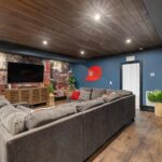
I’ve learned that blank walls aren’t gaps waiting to be filled—they’re actually powerful design tools that create calm and help your eyes rest in a busy room. When I left one wall bare in my living room instead of hanging art above the sofa, it suddenly felt more spacious and let my favorite piece (a 3-foot gallery canvas on the adjacent wall) become the real center of attention. Negative space works like a visual pause, and it’s helped me appreciate the decor I do display way more than when I had something on every surface.
Intentional Emptiness Promotes Calm
When’s the last time you felt relaxed in a room that didn’t demand your visual attention everywhere you looked? I’ve learned that empty walls aren’t laziness—they’re deliberate choices. My living room changed when I stopped filling every surface. Instead of gallery walls covering all four sides, I kept two walls bare. That negative space creates breathing room for your eyes, and honestly, I feel calmer just sitting there. Blank walls give your mind permission to rest. They work well alongside key pieces, letting one piece stand out without competition. When you’re surrounded by constant visual stimulation, your nervous system stays activated. Empty walls counteract that. They’re pauses in a conversation, allowing calm to settle in and helping you actually enjoy the space you’ve created.
Negative Space Enhances Visual Impact
They don’t plaster every wall because they understand that restraint signals quality, not emptiness. When I stopped treating blank walls as failures, my living room changed. Negative space creates breathing room that lets your best pieces stand out—that gallery wall, your favorite chair, a striking light fixture. I’ve noticed how a single piece of wall decor against 8 feet of calm white creates more impact than crowded arrangements ever could. Balance isn’t about filling every inch; it’s about viewing your space as a whole and adjusting over time. Strategic emptiness reduces visual fatigue, making your home feel organized and deliberate rather than cluttered. Your walls work harder when you let them breathe.
Balance Is the Real Goal, Not Complete Coverage

When I stepped back to look at my living room, I realized I’d been chasing complete coverage instead of focusing on how the space actually felt—and that’s when things clicked into place. Balance isn’t about filling every inch; it’s about distributing visual weight so your eye moves naturally through the room, with empty walls giving breathing room to your furniture, lighting, and architectural features. I now assess a room by standing in different spots and asking myself if the overall composition feels harmonious, not whether every wall sports a picture.
Visual Weight Distribution Matters
How do you know when a room actually looks balanced? I’ve learned it’s about distributing visual weight evenly across all your walls, not filling every inch. Think of it like this:
- Heavy furniture or bold artwork on one wall needs lighter, quieter spaces elsewhere
- Architectural features like fireplaces or large windows naturally anchor the room
- Negative space acts as a design element, giving your eyes places to rest
When I decorated my living room, I hung a prominent piece above my sofa, then left the adjacent wall bare. That empty space didn’t feel neglected—it felt deliberate. The balance between decorated and blank areas creates harmony. You’re not fighting for every square inch; you’re orchestrating what matters.
Strategic Empty Space Works
Why do the most visually restful rooms I’ve visited actually have fewer decorations, not more? I’ve learned that empty space isn’t lazy design—it’s intentional strategy. When I leave 40% of a wall bare, it gives my eyes somewhere to land and rest. Negative space creates visual calm that crowded rooms simply can’t offer.
Think of empty space as the silence between notes in music. It makes everything else matter more. A single piece of art on a mostly blank wall commands attention far better than three pieces fighting for notice. I’ve watched how this works: my living room felt chaotic until I removed two pieces, and suddenly the remaining artwork gained prominence.
Strategic emptiness shows confidence. It tells visitors you’re thoughtful about what deserves their attention.
Assessing Room Harmony Overall
The real test of good wall decorating isn’t whether every surface gets covered—it’s whether your room feels balanced when you stand in the doorway and take it all in. I’ve learned this the hard way after cramming art everywhere, only to feel visually exhausted walking through my own home.
True harmony comes from thoughtful choices:
- Visual balance across the room, not uniform coverage on each wall
- Negative space that lets your favorite pieces stand out and have room to exist
- Wall hierarchy that guides your eye naturally through the space
When I step back and assess from different angles—standing in the doorway, sitting on the couch, entering from the hallway—I notice what actually feels calm versus cluttered. That’s your real indicator. Your room should welcome you, not overwhelm you.
How Natural Light Changes What Your Walls Need?

Natural light is one of the biggest factors I’ve noticed when deciding which walls actually need decorating. When I repositioned my couch away from the south-facing window, I realized that wall didn’t need art anymore—the light itself became the focal point. Those dramatic brightness shifts throughout the day create their own visual interest.
I’ve learned that leaving negative space on sun-drenched walls actually makes rooms feel larger and more deliberate. Instead of filling every surface, I now assess how daylight moves across each wall seasonally. In winter, my north wall needed warmth through artwork, but come summer, that same wall stayed bare because natural light flooded in differently.
Your wall decor should work with the light, not against it.
Assess Your Wall Size Before You Decide

How much wall space are you actually working with? Wall size dramatically shapes what your space truly needs. When I measured my hallway, I realized those narrow twenty-four-inch walls looked perfectly fine bare. Here’s what I consider when assessing my walls:
- Compare wall dimensions to your room’s overall scale—large walls need substantial decor to maintain proper proportion
- Notice how small pieces disappear on expansive surfaces, requiring larger art or grouped arrangements
- Recognize that blank walls create calming negative space, not emptiness
I discovered that my living room’s massive feature wall demanded bold treatment, while my bedroom’s compact walls stayed serene without decoration. Size matters. Understanding your wall’s proportion prevents overwhelming your space or leaving it feeling incomplete. Know what works for your specific dimensions.
Let Your Room’s Architecture Be the Star
I’ve learned that sometimes the smartest decorating choice is actually doing less—letting architectural features like arches, built-in paneling, or tall windows be the main attraction. When I stopped filling every inch of wall space and instead left my 30-inch archway unframed, the room suddenly felt deliberate rather than cluttered. Restraint isn’t boring; it’s how you honor the bones of your space and give your eyes—and your mind—room to breathe.
Architectural Elements as Focal Points
Why cover up what’s already beautiful? Your room’s architecture deserves to shine as the focal points that define your space. I’ve learned that treating arches, fireplaces, and large windows as artwork changes how a room feels.
Here’s what I recommend:
- Keep walls near architectural features minimal—let that craftsmanship speak for itself
- Use negative space strategically so your architecture remains the primary design moment
- Balance heavier architectural sides by placing decor opposite, especially on walls exceeding 24 inches wide
When I stopped cluttering walls, something shifted. Premium materials and quality craftsmanship became visible. That restraint? It actually reduces visual fatigue and boosts perceived quality. Your architectural elements are already doing the heavy lifting. Sometimes good design means knowing when to step back and let your space’s bones shine.
Restraint Enhances Structural Beauty
I’ve learned that restraint is actually harder than decorating. When I stopped filling every blank space, my living room felt more considered. The negative space around my fireplace arch now lets that beautiful brickwork stand out. You’re treating your architecture as artwork itself.
| Design Choice | Result |
|---|---|
| Bare walls beside windows | Natural light becomes the focus |
| Unadorned arches | Craftsmanship reads as deliberate |
| Open spaces above furniture | Room feels calmer, less crowded |
| Minimal wall art | Premium millwork gets attention |
This approach prevents visual fatigue. Your space has room to exist. Balance happens when you view walls in a holistic way, considering sightlines and furnishings. Sometimes, doing less creates more impact than doing everything.
Use Your Furniture Layout to Guide Wall Placement

Once you’ve arranged your sofa, chairs, and tables, your walls basically tell you where they want art to go. Your furniture layout is the blueprint for smart wall placement. Here’s what works:
Your furniture layout is the blueprint for smart wall placement—let it guide where your art belongs.
- Identify primary focal walls—the space behind your sofa or above your fireplace—where bold pieces anchor the room
- Leave walls without furniture groupings blank to preserve visual balance and negative space
- Consider sightlines from doorways; art should guide attention toward your room’s center, not scatter it everywhere
When you stop trying to fill every wall and instead let your furniture arrangement guide you, your spaces feel deliberate. Larger furniture clusters benefit from bolder wall pieces, while smaller walls stay empty. This restraint creates the balance you’re seeking.
Gallery Fatigue: When Too Much Decor Backfires

You’ve got your furniture arranged perfectly, your focal walls identified, and your blank spaces respected—but then something sneaks up on you. Gallery fatigue happens when I fill every inch with decorative objects, overwhelming the room instead of enhancing it. I’ve learned that quality beats quantity every time.
When I stopped cramming walls and started being selective, my spaces felt more open. I now choose fewer, larger, meaningful pieces that draw attention. Instead of covering all four walls, I emphasize specific art moments on two walls, leaving others calm.
Decorative balance means mixing elements thoughtfully—maybe art, a mirror, floating shelves—spaced generously apart. This open space prevents overstimulation and keeps rooms feeling deliberate rather than cluttered. I regularly reassess as lighting changes, maintaining displays that stay focused and consistent.
Create Visual Rest Points With Negative Space

Why does a blank wall feel so much better than a crowded one?
I’ve discovered that negative space isn’t emptiness—it’s intentional breathing room. When I step back to assess my walls, I’m really looking for balance. Here’s what I’ve learned about creating visual rest points:
- Large bold walls benefit from blank areas, preventing visual overload and letting key pieces stand out
- High-traffic zones need uncluttered walls so your eye can move freely through the space
- Restful walls shift attention to lighting, rugs, and furniture silhouettes instead of competing elements
The trick? I assess overall balance by stepping back regularly. I don’t fill every inch—I let certain areas breathe. This approach gives my eyes genuine rest amid textures and colors, making my home feel calmer and more deliberate than when I tried decorating every surface.
One Statement Piece Often Works Better Than Many

How many times have I stepped back from a wall covered in small frames, only to feel my eyes bouncing around without landing anywhere? I’ve learned that one large piece often creates the calm I was actually seeking. A single 36-by-48-inch canvas above my sofa anchors the entire room, giving my eyes somewhere to rest. This central element does what ten smaller pieces couldn’t: it lets negative space breathe. When I replaced my cluttered gallery wall with one bold artwork, the room finally felt deliberate rather than busy. You don’t need to cover every inch. One well-chosen piece—whether a painting, textile, or sculptural element—can define your space while preserving the peaceful emptiness that makes a room feel lived-in.
How Room Function Influences Wall Decoration Choices?

While one distinctive piece can anchor a living room well, what works in that space doesn’t necessarily work everywhere else in my home. Room function shapes how I approach wall decoration. I’ve learned that:
- Corridors and narrow hallways work best with minimal wall decoration, keeping pathways visually open
- Bedrooms and studies benefit from fuller wall treatment since you’re stationary longer in these rooms
- High-traffic areas need fewer pieces to avoid visual clutter and prevent accidental bumps
In my busy kitchen with patterned tile backsplash, I intentionally kept opposite walls bare. This negative space prevents overwhelming the room. Meanwhile, my study features art on multiple walls because I spend hours there. The key is matching your decoration choices to how you actually use each space.
Mix Your Approach: Art, Mirrors, Shelving, and Sconces

I’ve found that mixing art, mirrors, shelving, and sconces changes a room from flat and one-note into something with real personality and purpose. When I layered a 24-inch round mirror beside a gallery wall of varying frame sizes—some 8×10, others 12×16—and added a floating shelf below with books and a small sconce, my bedroom wall suddenly felt dynamic instead of cramped. The key is balancing what looks good with what actually works: that mirror bounces light across the room while the shelf holds things I use, so every element earns its spot rather than just sitting there looking pretty.
Layering Different Decor Elements
When you’re staring at a blank wall, the temptation’s strong to fill it with just one thing—a single large painting, a row of floating shelves, or a statement mirror. I’ve learned that layering different elements creates the gallery wall feeling we all want. Here’s how I approach it:
- Start with one anchor piece (a 36-inch mirror or large artwork)
- Add complementary items in varying sizes around it
- Preserve negative space between each element
I discovered that mixing wood frames, metal sconces, and fabric textures prevents monotony. When I combined a 24-inch round mirror with smaller 8×10 prints and a brass wall sconce, the wall suddenly felt deliberate and connected. The key’s balancing your pieces thoughtfully—not cramming everything together.
Creating Visual Interest Through Contrast
How do you keep a wall from feeling flat and one-note? I’ve found that mixing your approach creates real visual interest. I combine wall art, mirrors, and shelving to build contrast that actually works.
Start with a large 36-inch mirror as your anchor piece. Add smaller mirrors in clusters nearby—I use 12-inch and 18-inch rounds together. Then introduce wall art at different scales: maybe a 24-by-36-inch canvas alongside smaller prints.
Layer in floating shelves with sconces above them. The lighting bounces off your mirrors, creating depth I didn’t expect. I’ve learned that varied piece types prevent things from looking repetitive.
The key? Balance negative space carefully. Don’t crowd every inch. Let your walls breathe while each element does its job, working together instead of competing for attention.
Balancing Function With Aesthetics
The trick to making a room feel intentional isn’t picking beautiful pieces—it’s figuring out where they actually live and what work they’ll do. I’ve learned that mixing art, mirrors, shelving, and sconces creates real balance without overwhelming your space.
Here’s what I’d suggest:
- Use mirrors strategically to reflect light and expand smaller rooms while serving double duty as art
- Layer shelving with curated objects that combine function and visual interest without clutter
- Install wall-mounted sconces flanking focal points to draw your eye where you want it
The real balance happens when you embrace negative space. I leave one or two walls intentionally blank so my art and shelving actually have room to exist. This approach lets each piece work on its own while keeping your room feeling calm and collected, not overcrowded.
Scale Your Decor to Match Your Wall Size

One thing I’ve learned from decorating countless spaces—both my own and while helping friends—is that wall size truly matters when you’re deciding what to hang. A large wall needs substantial pieces or gallery configurations to feel balanced. I once faced a bare 12-foot wall that felt empty until I added an oversized canvas. Meanwhile, small walls measuring 24 inches or less? They’re perfectly fine left simple or undecorated entirely.
The key to wall scale is matching your decor to your actual space. Bigger walls need bigger commitment—think larger artwork or grouped pieces. Smaller walls work best with single, modest items. This approach to decor balance prevents that awkward feeling of overcrowding or emptiness. I’ve learned this through trial and error, adjusting pieces as rooms evolved.
Strategic Decorating: Focus on One or Two Focal Walls

Rather than spreading your decorating energy across every wall, picking just one or two focal walls creates visual balance and lets your favorite pieces shine without overwhelming the space.
Here’s what I recommend:
- Choose your focal wall based on sightlines—the wall behind your sofa or above your fireplace works well
- Leave other walls mostly blank to provide negative space that enhances your decorated areas
- Balance visual weight by decorating the opposite side of architectural features on walls exceeding 24 inches
The blank walls aren’t wasted space—they’re breathing room. Rooms feel calmer and more deliberate when you resist decorating everything. Your focal walls deserve attention, not competition.
Refine Your Walls Over Time as Your Space Evolves
How’d you feel about your walls last year versus now? I’ve noticed my spaces shift constantly, and that’s totally okay. When I moved my couch last spring, I realized my gallery wall didn’t work anymore—it felt unbalanced. Instead of redecorating everything, I kept the negative space and added one small piece where it mattered most. This evolution teaches you what actually works. After swapping lighting or rearranging furniture, step back and reassess. Sometimes leaving walls bare creates the calm you didn’t know you needed. I’ve learned that design isn’t finished; it’s living. Your walls grow with you, finding better balance gradually. Pay attention to what feels right for your space.